COLOUR IN THREE DIMENSIONS
For my collaboration with Studio Asobi – Pottery Studio in Singapore, I worked on the development of an expanding library of ceramic glazes for use across the studio's pottery practice.
The work began with colour development, testing different glaze formulations through repeated cycles of mixing, application, firing and evaluation.
As the collection grew, another challenge became increasingly visible. A glaze is not experienced as a flat colour. Its character changes across curves, edges, recesses and different depths of application.
My interest shifted from simply developing more colours toward asking how the glaze library itself could communicate these qualities more clearly.
The project became both a material exploration and an exercise in building a more useful physical reference system.
PROJECT INFORMATION
Client
Studio Asobi – Pottery Studio in Singapore
Role
Glaze Development / Material Exploration / Reference System Design
Scope
Glaze Research / Colour Development / Testing / Ceramic Form / Material Reference System
Application
Studio glaze selection / Student reference / Commissioned pottery projects
01 / DEVELOPING THE GLAZE LIBRARY
Colour Could Not Be Designed On Screen
Ceramic glaze development is an inherently physical process.
A colour cannot be finalised through a digital swatch or formula alone. Every variation needs to be mixed, applied onto clay, fired and observed after the firing process.
The development therefore followed a repeated cycle:
mix
apply
fire
observe
adjust
Differences in formulation could alter colour, opacity, surface character and the way the glaze reacted during firing. Rather than designing colour as a fixed value, I was working with a material whose final appearance emerged through both chemistry and process.
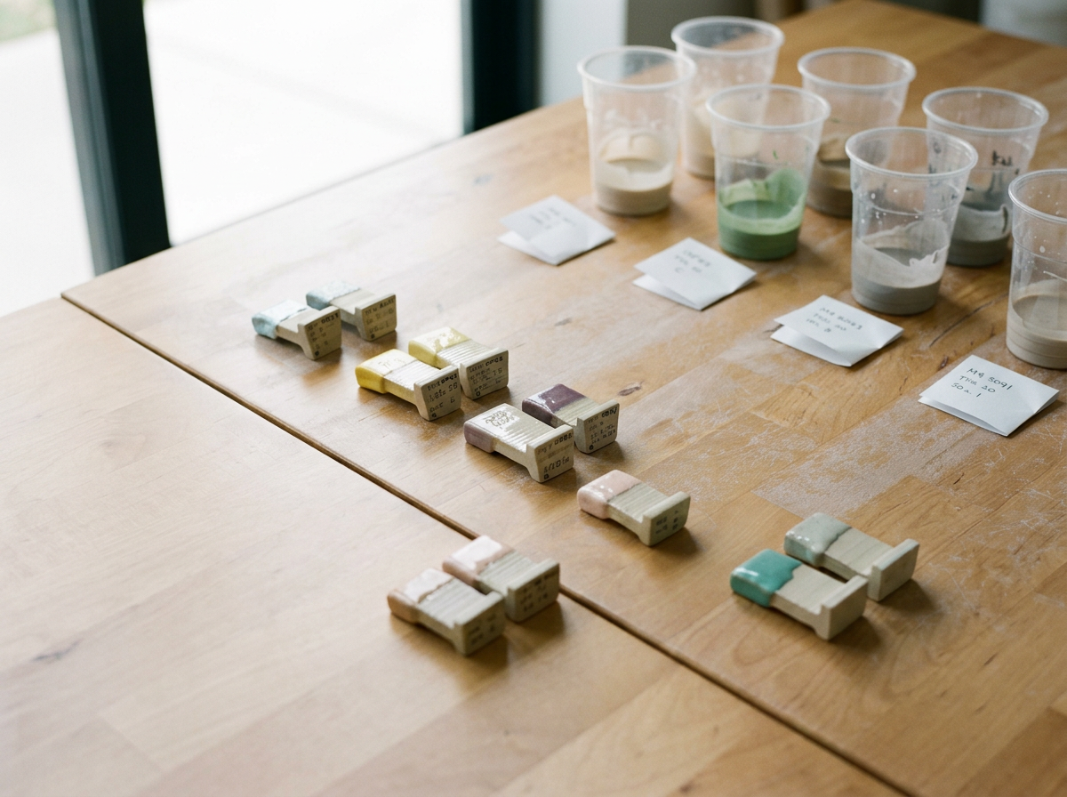
Glaze development through repeated formulation, firing and visual evaluation
02 / COLOUR WAS ONLY PART OF THE STORY
The Same Glaze Can Behave Differently Across A Form
As more glazes were developed, I began paying attention not only to the final colour but also to how each glaze behaved physically.
Some appeared relatively even across a surface.
Others became more expressive where the glaze accumulated, where the clay changed direction or where the coating became thicker.
These variations were part of what gave each glaze its character.
The challenge was that the studio's reference format could show the colour of the glaze, but not always the full behaviour that might appear when it was eventually applied to a vessel.
This raised a simple question:
Could the reference itself behave more like pottery?
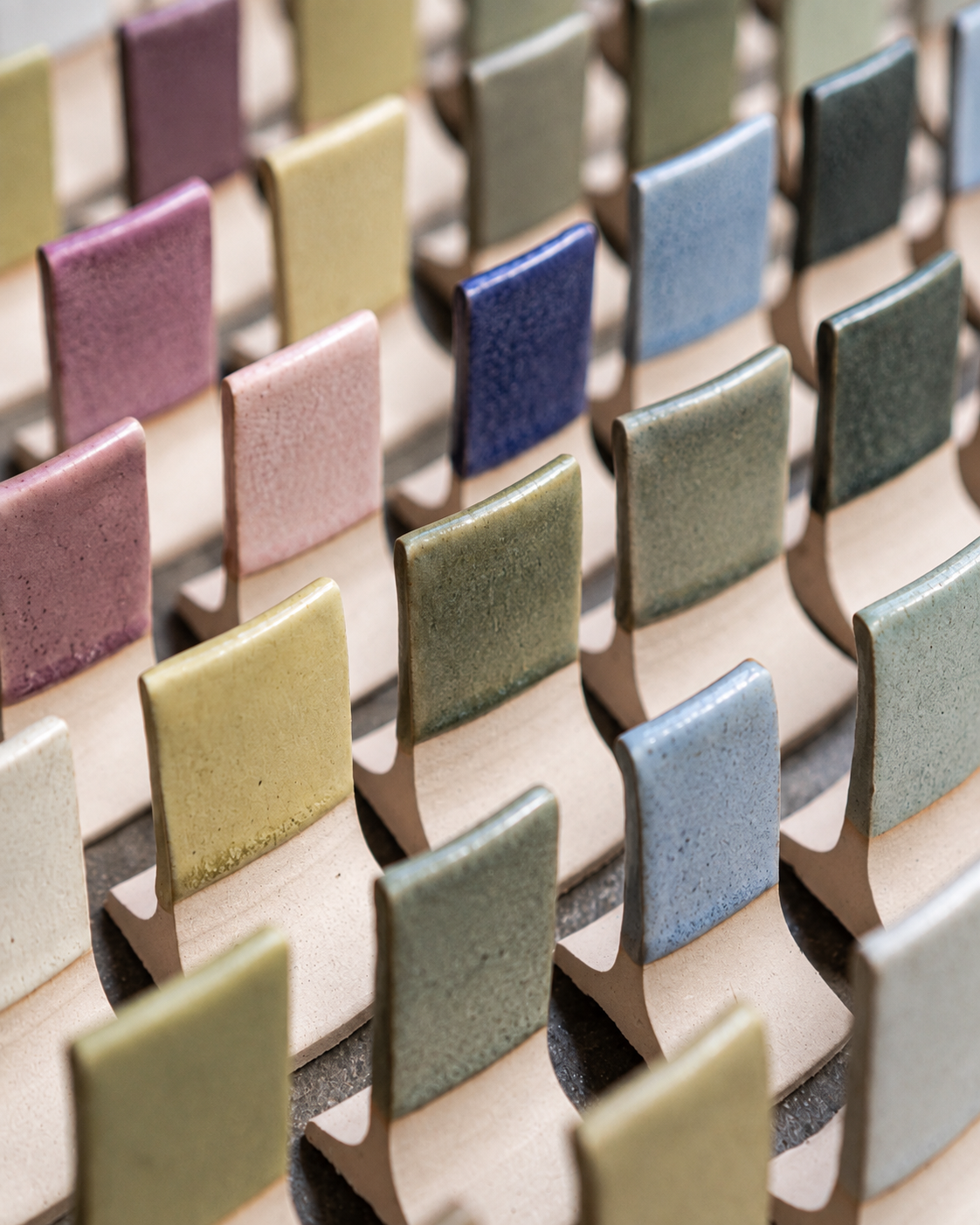
Studio Asobi’s existing flat test-tile format, shown with new glaze colours developed during the collaboration.
03 / RETHINKING THE TEST TILE
From Flat Sample To Three-Dimensional Reference
Traditional glaze test pieces are useful because they provide a consistent surface for comparing colours.
But pottery rarely exists as a flat surface.
Cups, bowls and vessels contain curves, interior and exterior surfaces, transitions, edges and areas where glaze naturally gathers.
I began exploring a three-dimensional reference form that could reveal more of these characteristics within a single object.
The intention was not to replace technical glaze testing.
It was to create a more expressive reference for understanding how a glaze might behave once it moved from a sample onto an actual ceramic form.
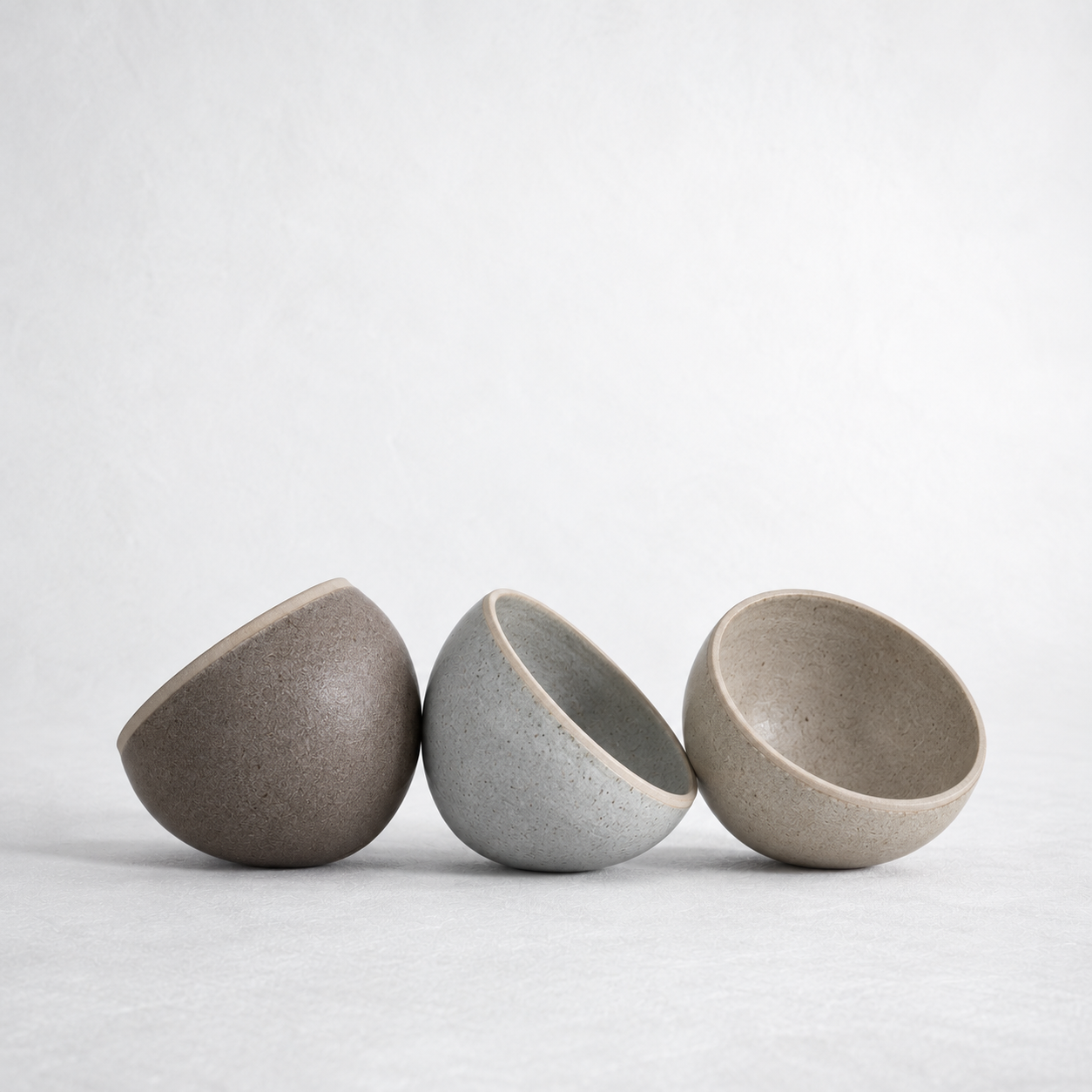
Moving from a flat colour reference toward a form that reveals more of the glaze's physical behaviour.
04 / DESIGNING THE REFERENCE FORM
The Shape Needed To Make The Material Visible
The reference form was developed around the characteristics I wanted the glaze to reveal.
Rather than creating a decorative miniature vessel, the geometry needed to perform a specific function.
Its surfaces allowed the glaze to move through different conditions:
interior / exterior
convex / concave
thin application / accumulation
flat areas / changing contours
These variations made it easier to observe how a single glaze changed across the object.
The form effectively became a small testing landscape.
Instead of looking at one patch of colour, the viewer could rotate the piece and read several behaviours from the same glaze.
05 / FROM OBJECT TO SYSTEM
One Reference Became Useful Only When Repeated
The individual ceramic piece was only one part of the idea.
Its real value emerged when the same form was repeated across the glaze collection.
Using a consistent physical reference meant that different glazes could be viewed under comparable conditions.
The repetition transformed individual experiments into a visual library.
Instead of asking:
What does this glaze colour look like?
the system made it easier to ask:
How does this glaze behave compared with the others?
That distinction changed the collection from a series of samples into a more useful decision-making tool.
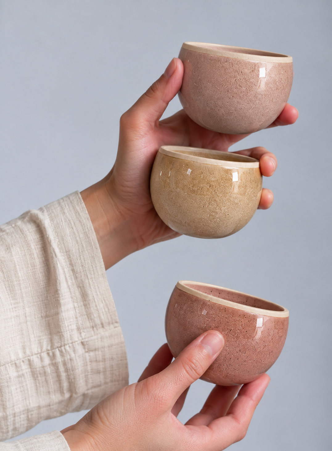
A consistent form creates a common visual language across different glaze formulations.
06 / NAVIGATING COLOUR PHYSICALLY
Browse / Compare / Observe / Select
As the library developed, the reference pieces created a physical way of navigating colour.
Glazes could be placed beside one another and compared directly rather than considered in isolation.
Subtle differences became easier to see:
colour temperature
surface finish
variation
depth
movement
areas of accumulation
The system supported a more tactile selection process, allowing colour and surface behaviour to be considered together.
For Studio Asobi, this was particularly relevant when discussing glaze options for pottery made by students as well as work developed for commissioned projects.
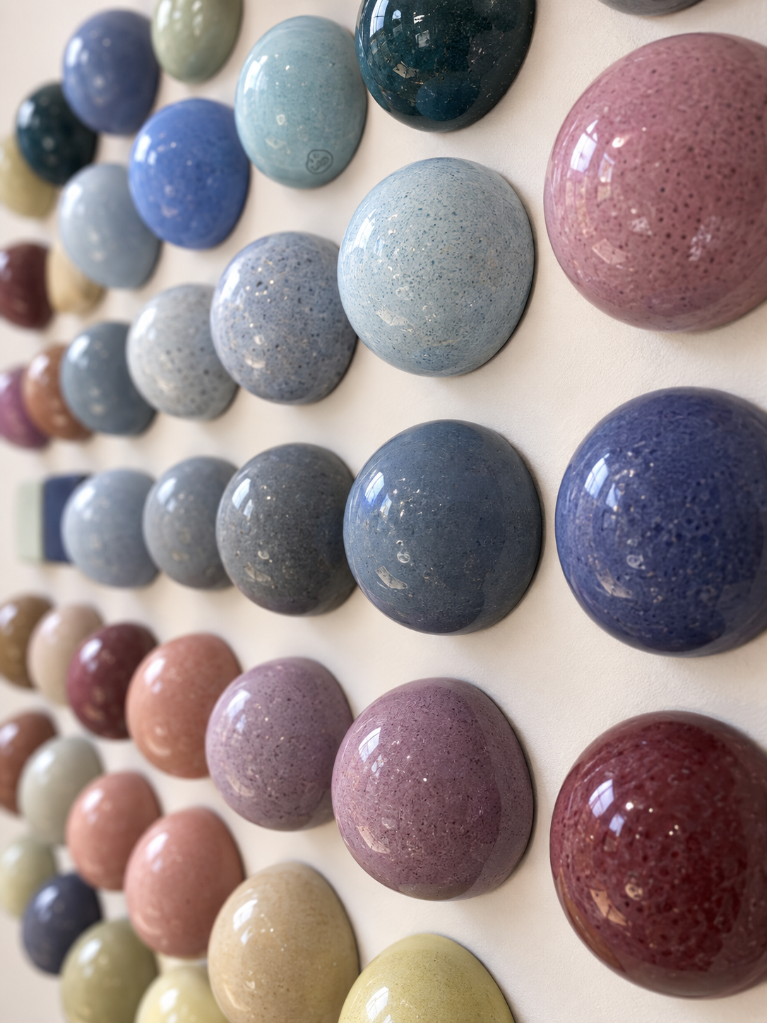
The glaze library turns material experimentation into something that can be physically browsed and compared.
07 / MATERIAL AS INFORMATION
Designing The Tool, Not Just The Colour
What interested me most about the project was that the final design outcome was not a single glaze.
It was a way of making the entire collection easier to understand.
The glaze itself remained the subject, but the reference system became the interface between material experimentation and decision-making.
A small change in format made qualities that were previously difficult to communicate more visible.
The work moved from:
developing colour
toward:
developing a language for understanding colour.
FROM MATERIAL TO SYSTEM
This project changed how I think about systems.
They do not always need to exist as grids, interfaces or brand guidelines.
In this case, the system was physical.
A repeated ceramic form created consistency, while the behaviour of each glaze introduced variation.
The project began with the development of individual colours but gradually became an exploration of how design could make a complex material library easier to see, compare and understand.
